Description
Not long after I put together the new version of “Roche Limit” I thought it would be fun to
create a view “from the ground”.
For this one, though, I thought I would get away from the
placid tropical scenes. I wanted instead to depict a world on
the very edge of being ripped apart be the tidal forces of a huge
nearby planet.
Believe it
or not, as I was researching a proper name for this piece I
learned that the landscape I imagined is not entirely
fantastical! I love science!!
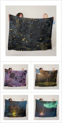
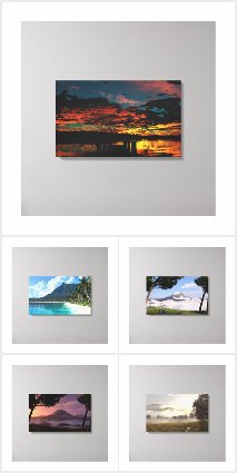
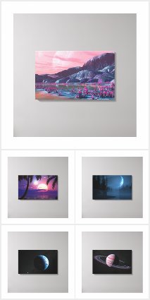
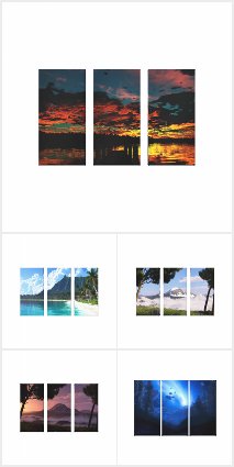

 Asunder: asunderfluorescence1
 Asunder: asunder1
 Asunder: rocheocean1
 Asunder: asunder2


David Merchant –
For me, this standard or “through a window” look works for this image because a planet-moon that size that near the rings would definitely be acting as a shepherd moon/planet creating waves in the ring material closest to it (waves before and after it) and so the framing of this image covers where those waves would be. If not, I would feel something amiss–for a planet/moon that size that near and not affecting the rings would not feel quite right. The plants are quite fine–science predicts plants on other worlds would be different in color depending upon the color of the star and also depending upon how much light reaches the planet. This is definitely going into my wallpaper rotation.
Shepherd moons and waves reference: https://astronomynow.com/2017/01/19/saturns-shepherd-moon-daphnis-makes-waves/
Mark Nemecek –
great work here. the “non-watermarked lossless master” image is still watermarked, though. cheers.
Tyler –
Such an intriguing, wondrous environment. Is there an oxygen atmosphere around those rings? It tickles the mind to imagine the possibilities.
JT –
I love it Ryan! I’m wondering if you are making a Multiscreen version of Asunder Flourescence?!?! I would be an awesome addition. Keep doing what you do… It’s great art!
Jeremy –
I love the color combinations with this one. I’m hoping you can somehow make a sualscreen of this? Keep this awesomeness coming!
Alex –
Please tell me that there is a multiscreen in the works! This one is in my top 5.
James –
Stunning! Please upload some multiscreen versions 🙂
Jason –
Truly spectacular piece. I cannot wait for the multi screen renders of this one.
Thomas –
The original Mushrooms where the reason i came to you in the first place. This would be a really nice remake of it and i also like the colours!
PLS make dual screens of this part!
Pat –
I love the combination of these images with the unique color scheme really brings an old classic image to a whole new level. I love the plant looking objects in the background.
Bob C –
I find it delightful and amusing that I didn’t see the signature DB flourescent mushrooms growing all over place in the earlier render until this detail was put up. Great fun!
Mark –
It’s excellent. I do think, however, that I like Asunder 2 better. I like the foliage and purple tones on it better, and just think it turned out overall a little better.
kyahgirl –
I read a lot of sci/fi and this image has an awesome ‘otherworldly’ feel.
Jenanne –
While I love the 2nd and final renders of Asunder, I do wish, as others have mentioned, that we could have more resolutions for Roche Ocean, and perhaps some multiscreens. I’m not sure what is so attractive about this render — perhaps it’s the clean lines and uncluttered feel — but it’s my favorite of the bunch. As Gene said, sometimes less is more. 🙂 How about it, Ryan?
Linda Hall –
I like asunder1 because I rather see the planet partially hidden by the brush. And the last version, asunder2 is very sloppy to me. This is because of a glowing lichen (the only fungus I know of (?). Oh did you know that Lichens have also been used in making dyes and perfumes, Also used in modern day medicines.
Molly –
I didn’t think I’d like any version better than the original, but I was wrong. Simply amazing, as always!
Harry –
To be honest I am abit mixed about the standard images, there seems to be something ‘missing’ in terms of the upper atmosphere and the horizon. It gives me more of the feel of a portal infront of the character that is so large we cant see the edges.
I do however love the fluorescence close up, it might have even shot straight in the top four favorites ever. I would say that there is a good chance that it would become the next poster I purchase as well. I believe that it should be made its own image (with all the associated resolutions and file formats, Lossless pls.) and the only tweeks I could even think of would be a duplication of the green onto the most left 2 mushrooms, a removal/softening of the fibres that bisect them and a small tidy up of some of the angles the stems exit the ground. I think it’s beautiful in its current complexity.
Thank you for a brilliant image.
Nico –
asunderfluorescence 1 I like the concept can some red mushrooms be in there maybe on the left side
?
Jenanne –
I love this final render. And you can recycle those iconic mushrooms any time or place you like. This is fantastic!
D –
If you removed the clouds in the distance or just made them more subtle this would be a 10.
Kana –
Any chance we can get a blue AND green version of the mushrooms in the pickle jar? Love the final update 🙂
sundogvet –
I didn’t love the first iterations. This is lovely! I think you made your point very well.
Sanalith –
I’ve been waiting to use this until it felt “finished” to me, and this is it! Absolutely lovely work. It really takes me into another world.
Jenanne –
I really like the new Asunder render in the works. I particularly the colorful mushrooms. Can’t wait to see the finished project!
Gene –
In my eye, the plainer ocean-foreground variant is distinctly nicer than either the original, or the current version. Sometimes less is indeed more, and IMO, this is one of those times. I still really like the overall concept (I commented on the first version). Perhaps my resistance is rooted in the “busy-ness” of the foregrounds distracting from the grandeur and power of sky. Keep up the good work!
Marta –
This is great! Love the colors and they would look great on my dualscreen 5:4, 2560×1024 at work – please make it available soon. I think a lot of these are more effective when displayed across a wide screen. Thanks – been a follower for over 15 years!
Charles –
I think your landscapes are infinitely better that these fantasies. There is nothing more beautiful than nature itself.
Hawk –
Love it!
Love the shades of purple. The whole thing kinda reminds me of Avatar.
Keep up the good work!
Alex H –
The noodle one isn’t all that amazing, but the other picklejar image is ace. While I appreciate the detail on the main page one, I have to say my favs would be the standard roche limit view from space and the “planet over sea” picklejar image. Oh btw, could you please do a picklejar render of roche limit with the rings tilting to the bottom left of the screen rather than the top right? Similar to the green roche?
Eric –
The hyperlink for rocheocean1 2880 x 1800 (Retina) is pointing to asunder 2880 x 1800 (Retina). Both have the same url.
Scott –
I like this one better than the first. I like the first one but the “noodle” effect as you put it just look silly to me. I like that you tried to convey the planet breaking apart because of proximity to another planet. The “noodle” effect just doesn’t fit. It the planet is breaking apart, give me some crags and broken pieces floating off, not a “noodle” effect. This one at least I can stare at for a while looking at all the detail.
Hoverwolf1 –
I prefer the first version, which I would rate as a 9.5. No offense, but this rewrork looks like Phraxis, only more busy. It’s too much of the same thing. The first version was best, because it was accurate. Who cares whether it made people happy or not?
Keep being original (and true to the material); that’s why we love your work, not because it appeals to the masses.
Jenanne –
Hi Ryan,
The Rocheocean 2880×1800 resolution is missing; in its place is the asunder1 render. Thanks.
Ryan –
I see your point. I’ve reused items here and there quite often actually. My computer science professors hammered into us that we were never to reinvent the wheel. I try to never simply “cut and paste” however without somehow “evolving” the item into something new.That said, if you don’t like seeing familiar objects you will probably hate the “final” update I have rendering right now…
JD –
Cut and past using artifacts from some of your previous renders? C’mon now.
Josh –
Surprised by the low ratings. I really love this concept and your style here. Just strikes me as beautiful.
sundogvet –
That’s so sad! It’s a planetary body in the Roche limit of a larger planetary body, and there’s life on it. It’s all going to unravel like the embroidery in that Ray Bradbury story, and that’s just SAD!
Sharon –
I really like both versions of this image. The original is incredibly unique. This one tends to blend better together with the color match between foreground and background. Now add the flowers along the bottom to the original and I think it would do great.
The fact that the original is more physically plausible makes me like it even more. The spaghetti effect is not something we have seen in your other images so it was a little hard to get used to at first. After staring at it for a week, however, I’ve liked it more and more. Both images definitely have their merits. Great work!
Ben –
I mush prefer this version to the first. It has more detail and gives the eye something to look at in the foreground. With the other version it was more like a silhouette of something with little or no light to attract the attention in the foreground. Excellent work. Only thing I would change would be more variation in colors.
ChrisSpera –
Its good; but its so…PURPLE! either pick a different color for the planet or one for the flora in the foreground.
Daniel –
What I liked so much about the first version of this render was the fact that it conveyed movement. You couldn’t imagine a motionless scene there, and I believe this restlessness is exactly what was intended (and an unsettling, ominous feeling that the whole thing is so fragile that it will shatter at any moment). Despite the angry comments, I think this was one of the best space scenes so far, because it’s so hard to give a convincing impression of movement to a still scene, let alone a space one. It has a lot of power.
The update is nice, but it’s more of the same we’ve seen around many times.
(and, being a physicist, I’d say that the first one is also more plausible, but I prefer this comment to be about the art)
Ryan, if you consider making a multiscreen of this scene, I’d really like to see the first one.
Couz –
Ooooooh. I’m in love again !!!
RC –
I like this. Reminds me a bit, albeit around a planet rather than a star, of the gas halo and its tree reefs described in Hamilton’s novel Judas Unchained.
ED –
This is pretty cool! it make’s me think of your 90’s picture’s
and why was your suff so weird and dark back then?
Joe –
I was looking forward to this render, but unfortunately it fell short. Maybe it’d be better if either more of the planet was visible, or the stringy ‘noodles’ were attached to something (like a plan?). Oh well, they can’t all be winners.
drow –
i imagine the small figure saying, “i’m batman”
Chris S –
Actually, having read Integral Trees by David Niven and “Endymion” by Dan Simmons, I see a more peaceful scene; a space-bourne arbour, in which stands one of its keepers, contemplating the slow revolution of his/her home around the nearby gas giant … ? I’m noticing that a lot of your work tends to have one colour predominate. The last two are very purple, for example. Is that intentional?
Rose –
To me, the curvature of the planet looks slightly lopsided. The bottom is more rounded than the top and that throws it off. That being said, I think the concept behind it is great!
John –
I really like the planet and the ocean of stars in the distance look. But the “squiggly” lines at the front of the mysterious cloak figure just looks…strange. I wouldn’t think that is what it would look like when a planet is beginning to be torn apart.
That being said, I see where you were wanting to go. I also understand the wanting to get away from earth type worlds such as “thetis moon” But if i am to be honest, i feel this could be much better with a little extra work.
BUT! I am a sucker for space scenes and planetscapes. Which is why i give this a 7/10. I like it a lot, but i don’t “love” it.
Dave T –
It’s cool. Walking the line between abstract and non-abstract.
Jared –
It’s not quite how I would picture a planet being ripped apart by tidal forces with me on it, but I think it looks pretty cool! I was thinking something akin to “At World’s Edge” and/or “Cloud Canyon” in the making, with large chunks of the planet being ripped off! If that makes sense 🙂
I’ll admit the strands in the distance hazing out kind of looks odd, but I think I understand where you were going with it. I’m sure it’s not easy to portray something at this large of a scale & so destructive!
KRingg –
I really love the concept, but it’s not there yet.
I think my biggest problem is *regularity* of the “ring strands”. Others have mentioned the jaggedness… but I’m more distracted by the even cyclic nature of said jaggedness. As the ring strands stretch into the distance, they begin to look like a GIMP/Photoshop novice abused the clone tool.
If you can make the wave forms more spastic and irregular (a la the foreground), this will certainly replace Sakura on my workstation.
TwoWolves –
After a run of four excellent renders its back to earth with a bump. Grainy muddle with some bloke in a hood in the middle – pure cheese. Eugh.
Eel River –
This piece isn’t THAT much different than the previous Roche Limit pieces. And frankly, I’m shocked at all the negative ratings and comments. I like it because Ryan took a risk. It’s a cross between and beach scene and a space scene, and it makes the viewer exercise his or her imagination: something that is in short supply among db subscribers it seems.
George –
I see what you were trying to do here in terms of experimentation and I approve of the attempt. For that reason I like it..
As a serious comment as a long time subscriber however, someone below mentioned that modelling on previous renders might not be the way to go, and honestly I’m sort of getting tired of logging on here and getting excited because I see you put a new render, but then seeing it’s just an adaptation of one you JUST finished a few weeks ago. I appreciate revisiting past works, and exploring things from different perspectives, but give it some more time in between copies.
Gene –
I’m back-and-forth on this one. I rated it the same as your recent Roche piece, but that one is much more integrated and bold in my eyes.
What really got my attention — and caused me to move you several digits up the scale — is the CONCEPT. I’ve been a space and sci-fi junkie for decades, and it never occurred to me to consider how things might appear from a moon of a ringed planet — especially one perilously (?) close to the Roche limit. I deserve a “duh,” and you get kudos for thinking of it this way. Now, just address some of odd details (like all that floating seaweed… 😉 ), and you’ll have a real home run.
Keep up the good work!
SimonRev –
I think that it is a solid first attempt, and I like the concept — moving beyond a tropical ocean as the foreground is a great idea.
I do think the planet appears egg shaped (this is an interaction between the way the zigzags and the rings seem to foreshorten the lower half of the planet)
I like the strands in the foreground, but in the center space they do seem to get muddled and confusing.
As a side note, I am fairly sure that on a satellite such as this that is operating somewhere in between its liquid body and rigid body Roche limits, then loose objects (like the person) will tend to get float off the satellite. Perhaps the guy should be on a tether (just kidding 🙂
Jase –
The planet is nice as are the rings but I can’t tell what’s going on in the foreground. My mind wants to see a beach with trees but it’s not really that and I can’t make heads nor tails of what it is.
Jase –
The planet is nice as are the rings but I can’t tell what’s going on in the foreground. My mind wants to see a beach with trees but it’s not really that and I can’t make heads nor tails of what it is.
Jenanne –
I’m sorry for the low rating, Ryan; this is the lowest I’ve ever given, particularly for a space scene. I like the overall idea, but this one just doesn’t depict what you attempted, IMHO. In particular, the zig-zaggy lines just below the rings seem out of place. Yes, experiments fail but don’t stop your future attempts. The majority of your experiments are wonderful!
Mark –
Love it!
D –
I really like the concept but the ringed planet appears to be egg shaped. Perhaps try again and tilt the rings a bit.
Ryan –
Ah well, I guess sometimes experiments fail. Perhaps I will put together something a little more conventional. I did want to try something very different for this piece but maybe this is too different. Thanks for the feedback!
Afya –
I do enjoy these concept works on an intellectual level, but what you describe isn’t what I’m seeing. I don’t see the vastness of a planet there – it looks far too close to the moon spaghetti in the foreground.
I also express a gentle wish that you didn’t put a human on these planetscapes. That little cloaked figure instantly rips away any sense of authenticity for me.
Doug B. –
Far too cluttered up for my tastes, the latest rendition of ‘Roche Limit’ is perfect, IMO, why tamper with it?
Terry –
I’m not sure on this, its interesting but I’m not sure if I personally like it or not. Its true that no new ground is ever charted by those who play it safe and you’re always trying new things that for sure.
Katie –
I’m not submitting a rating for this one yet, because to me it doesn’t look finished.
I currently have the “from space” version of the new Roche Limit as my desktop wallpaper, and I must say, the planet looks quite nice–surreal, but incredibly detailed. In contrast, the planet in this “from the ground” render looks blurred and low-res, with some weirdly contrasty bits getting blown out to white.
The “spaghettified” rock closest to the camera looks great–organic and creepy in the best of unnatural ways. But it all just turns into identical zig-zags in the background, like something out of the Bryce Deep Texture Editor (I hypothesize that this is one of the things prompting the “90s” comments).
I’m not one to tell artists how to do their work; I can only say I’d prefer something that looked a bit more polished. I know you often go through and tweak pictures after posting them, so I’ll wait to see if anything new arises. And if nothing does, that’s fine too 🙂
Cougz –
I’m trying to work it out.. Are they branches or trees ? Is the man standing on logs or fallen branches ? Hmmmm
John –
The planet doesn’t look circular, looks kinda of skewed like it was stretched vertically. Throws the image off for me.
JD –
Plundering old renders may not be the way to go forward.
Simon –
Have to agree with most of the others; adore your work (life member), but this image is unconvincing & looks like it was done 20+ years ago…
Eyal –
I don’t know… Something in this one just isn’t working… Maybe the proportions or the fact that the scenery is noticeably digitized…
I’m usually all for the space sceneries, but this one just doesn’t cut it…
Kodar –
Great picture as the humanoid in the ivy sea with some of the other nearby elements of a possible fire give a great aspect. A possible optical illusion is that to the left and just slightly above the person is some ivy or growth that has a different curve which makes the planet to appear egg shaped.
It reminds me a little of the D&D Spelljammer campaigns as it may be possible for life to live among the rings of a planet as it would not be surprising to have a campfire and some type of minimalistic housing off to the side.
This coming from the guy who has a Xorn tattooed to his breast.
Slack –
Your art rocks, but this one is a miss.
Grainy, angular, choppy. Looks like something rendered from 1997.
CM –
Really surreal, nice stuff… I like the way I can’t figure out wtf is going on here.
Matt –
I like the idea of doing a “from the ground” and not having a tropical theme, but this one just doesn’t work for me. The close up rendering doesn’t look natural. It’s also hard to distinguish what is happening in the middle. I would be interested to see another twist on this.
Aria –
Intriguing, good concept, (and I almost always like the space scenery stuff) but something is just a bit off.
John B –
Huge improvement over the first one. This one just makes more “sense” then the other one did. I love space scenes and planetscapes and this one is pretty awesome, Great job.
Jacob –
It too reminds me of Avatar. The colors are a nice combination. The “guy” seems a bit out of place to me, but all in all, it’s a very nice render. I love the details of the blades in the tree-stalks and the mushrooms everywhere. Fine detail such as this looks amazing! Great job!